So, someone asked me about my summer time availability at work. I realized that my availability was a bit complex and perhaps it was easier to sent a figure/diagram rather than explaining it in 200 words. That’s where I thought of the idea of creating an availability calendar using ggplot2. The idea is to show basically three categories: available, not available and a limited period (where I am not available in person, but can read emails).
First, we prepare the general date range as a data.frame. Character dates are converted to date format. Then day, week, month and date are extracted from that as separate columns for ease of plotting.
# prepare date range
dfr <- data.frame(date=seq(as.Date('2018-06-11'), as.Date('2018-08-12'), by=1))
dfr$day <- factor(strftime(dfr$date, format="%a"), levels=rev(c("Mon", "Tue", "Wed", "Thu", "Fri", "Sat", "Sun")))
dfr$week <- factor(strftime(dfr$date, format="%V"))
dfr$month <- factor(strftime(dfr$date, format="%B"), levels=c("June", "July", "August"))
dfr$ddate <- factor(strftime(dfr$date, format="%d"))

> head(dfr)
        date day week month ddate
1 2018-06-11 Mon   24  June    11
2 2018-06-12 Tue   24  June    12
3 2018-06-13 Wed   24  June    13
4 2018-06-14 Thu   24  June    14
5 2018-06-15 Fri   24  June    15
6 2018-06-16 Sat   24  June    16
Then we add our tracks to define availability into a new column named comment. We first set all comments to “Available” and then overwrite the ranges based on our availability. I have also added weekend as a category so it can be coloured differently.
# add date tracks
dfr$comment <- "Available"
dfr$comment[dfr$date>=as.Date('2018-06-11') & dfr$date<=as.Date('2018-06-20')] <- "Limited"
dfr$comment[dfr$date>=as.Date('2018-06-21') & dfr$date<=as.Date('2018-06-29')] <- "Not available"
dfr$comment[dfr$date>=as.Date('2018-07-09') & dfr$date<=as.Date('2018-07-13')] <- "Not available"
dfr$comment[dfr$date>=as.Date('2018-08-06') & dfr$date<=as.Date('2018-08-10')] <- "Not available"
dfr$comment[dfr$day=="Sat" | dfr$day=="Sun"] <- "Weekend"
Then I convert the comment column into a factor with custom level order. This order determines the order in which the labels will be shown in the plot legend.
dfr$comment <- factor(dfr$comment, levels=c("Available", "Limited", "Not available", "Weekend"))
Finally, the plotting. Columns week and day are used to define x and y axes. geom_tile() creates the blocks and colours for each day. facet_grid() is used to separate months. scale_fill_manual() is used to assign custom colours. theme_bw() and theme() are used for fine adjustment of plot layout.
# plot
p <- ggplot(dfr, aes(x=week, y=day))+
 geom_tile(aes(fill=comment))+
 geom_text(aes(label=ddate))+
 scale_fill_manual(values=c("#8dd3c7", "#ffffb3", "#fb8072", "#d3d3d3"))+
 facet_grid(~month, scales="free", space="free")+
 labs(x="Week", y="")+
 theme_bw(base_size=10)+
 theme(legend.title=element_blank(),
       panel.grid=element_blank(),
       panel.border=element_blank(),
       axis.ticks=element_blank(),
       strip.background=element_blank(),
       legend.position="top",
       legend.justification="right",
       legend.direction="horizontal",
       legend.key.size=unit(0.3, "cm"),
       legend.spacing.x=unit(0.2, "cm"))
And then save the plot.
ggsave("calendar.png", p, height=10, width=14, units="cm", dpi=300, type="cairo")
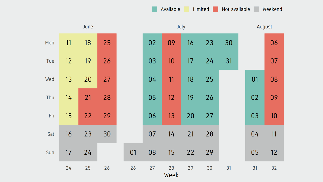
And we have our finished calendar. The custom font I used in the plot is called Gidole. To use custom fonts, import the font using library extrafont . Then in theme_bw() , set base_family="Gidole" . Also in geom_text() , set family="Gidole" .


Comments