This post/code is now outdated. Please see this new post for updated code.
This was inspired by the disease incidence rate in the US featured on the Wall Street Journal which I mentioned in one of the previous posts. The disease incidence dataset was originally used in this article in the New England Journal of Medicine. Here, I use the measles level 1 incidence (cases per 100,000 people) dataset obtained as a .csv file from Project Tycho. Download the .csv file here or head over to Project Tycho for other datasets.
In this post, we will look into creating a neat, clean and elegant heatmap in R. No clustering, no dendrograms, no trace lines, no bullshit. We will go through some basic data cleanup, reformatting and finally plotting. We go through this step by step. For the whole code with minimal explanations, scroll to the bottom of the page.
I am running R version 3.2.0 64-bit on Windows 8.1 64-bit. Packages in use are ggplot2 (1.0.1), reshape2 (1.4.1), plyr (1.8.3) and Cairo (1.5-9). Install the necessary packages if not already installed and load them.
#install packages
install.packages(pkgs = c("ggplot2","reshape2","plyr","Cairo"),
dependencies = T)

#load packages
library(ggplot2) #ggplot() for plotting
library(reshape2) #melt(), dcast() for data reformatting
library(plyr) #ddply() for data reformatting
library(Cairo) #better aliasing of output images
Data preparation
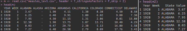
Read in the .csv file and inspect the data. The first two rows with non-table data is skipped.
#read csv file
m <- read.csv("measles_lev1.csv",header = T,stringsAsFactors = F,skip = 2)

#inspect data
head(m)
str(m)
table(m$YEAR)
table(m$WEEK)
The head() function shows us the header names and the first 6 rows of the data. The str() function shows that YEAR and WEEK columns are stored as integers and the incidences as characters. The incidences although numeric have been read in as character because missing values are coded as “-“. The table() function is used to check for any missing years or weeks. The data is currently stored in so called ‘wide’ format which we will convert to ‘long’ format. The ggplot2 plotting package prefers long format. The YEARand WEEK variables are kept as is and all incidence values are collapsed into a variable and value column.
#convert data to long format
m2 <- melt(m,id.vars = c("YEAR", "WEEK"))
#rename column names
colnames(m2) <- c("Year", "Week", "State", "Value")

#inspect data
head(m2)
str(m2)
The State variable is currently in all caps and multi-word states have dot separators. I prefer to have them in Camel case and separated by space to be shown on the plot later.
#custom function to convert to camel case
camelCase <- function(string=NULL,separator="\.") {
if(is.null(string)) stop("No input string.n")
s <- strsplit(string, separator)
s <- tolower(s[[1]])
paste(toupper(substring(s, 1, 1)), substring(s, 2),sep = "", collapse = " ")
}

#change variable to character, convert to camel case,
#remove dot and change variable back to factor
m2$State <- factor(as.character(sapply(as.character(m2$State),camelCase)))
A custom function is used to change the states into camel case. Multi-word states are split at the dot separator and each word is changed into camel case. Now we change other columns Year and Weekinto factors. We also need to convert the Value field from character to numeric and change the “-“ to NA. We could use sub() function to replace the “-“ with NA. But, an easier way to to just use as.numeric() which automatically converts non-numeric content into NAs.
#change variable types
m2$Year <- factor(m2$Year)
m2$Week <- factor(m2$Week)
#also converts '-' to NA
m2$Value <- as.numeric(m2$Value)
Now, I would like to plot the heatmap with the Year on the x-axis and State on the y axis, which means we have to deal with the Week variable in some way. We will sum all the incidences from all weeks for each year and discard the Week variable. The ddply() function from package plyr is suitable for this purpose. We need to use the sum() function inside ddply() to sum incidences over weeks. The way sum() handles NAs is a bit strange. By default, it returns NA if one or more elements in the input vector is NA. If we set argument na.rm=TRUE, then NAs are removed and the remaining numbers are summed. But if all the elements are NA, the sum is returned as zero. This is weird and undesirable in this situation. Therefore, I have a custom sum function to remove NAs and return the remaining sum or return NA if all elements are NA. We then use this custom function inside ddply() function to summarise the data by year and state while getting rid of week.
#custom sum function returns NA when all values in set are NA,
#in a set mixed with NAs, NAs are removed and remaining summed.
naSum <- function(x)
{
if(all(is.na(x))) val <- sum(x,na.rm=F)
if(!all(is.na(x))) val <- sum(x,na.rm=T)
return(val)
}
#sums incidences for all weeks into one year
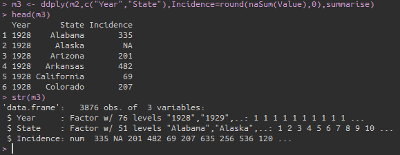
m3 <- ddply(m2,c("Year","State"),Incidence=round(naSum(Value),0),summarise)
#inspect data
head(m3)
str(m3)
At this point, the data preparation is essentially over. The data is in ‘long’ format, the x, y and z variables for the plot are available and are of the correct type: factor, factor and numeric. If your data is already in this format, it is easy to jump straight into visualisation. But depending on what sort of data you start off with, the data preparation and reformatting can be complicated and tedious.
Plotting the data
I prefer to use the ggplot2 plotting package to plot graphs in R due to its consistent code structure. I will focus mostly on ggplot2 code here. But, just for the sake of completeness, I will also include some basic heatmap code using base graphics.
Plotting using ggplot2
Once the data is in the right format, plotting the data is rather simple code in ggplot2. The ggplot2 index page has the code syntax and arguments.
#basic ggplot
p <- ggplot(m3,aes(x=Year,y=State,fill=Incidence))+
geom_tile()

#save plot to working directory
ggsave(filename="measles-basic.png",plot = p)
The default vanilla output from ggplot2 is decent and quite frankly impressive. A hell of a lot better than the monstrosity produced from the base graphics function heatmap(). But of course, there are several aspects of the basic plot that can be modified and tweaked. To begin with, the years on the x-axis can be rotated 90° or 45° to make it more readable. The ggplot code is modified below.
#modified ggplot
p <- ggplot(m3,aes(x=Year,y=State,fill=Incidence))+
#add border white colour of line thickness 0.25
geom_tile(colour="white",size=0.25)+
#remove x and y axis labels
labs(x="",y="")+
#remove extra space
scale_y_discrete(expand=c(0,0))+
#define new breaks on x-axis
scale_x_discrete(expand=c(0,0),
breaks=c("1930","1940","1950","1960","1970","1980","1990","2000"))+
#one unit on x-axis is equal to one unit on y-axis.
#maintains aspect ratio.
coord_fixed()+
#set a base size for all fonts
theme_grey(base_size=8)+
#theme options
theme(
#bold font for both axis text
axis.text=element_text(face="bold"),
#set thickness of axis ticks
axis.ticks=element_line(size=0.4),
#remove plot background
plot.background=element_blank(),
#remove plot border
panel.border=element_blank())

#save with dpi 150 and cairo type
ggsave(filename="measles-mod1.png",plot = p,dpi=150,type="cairo")
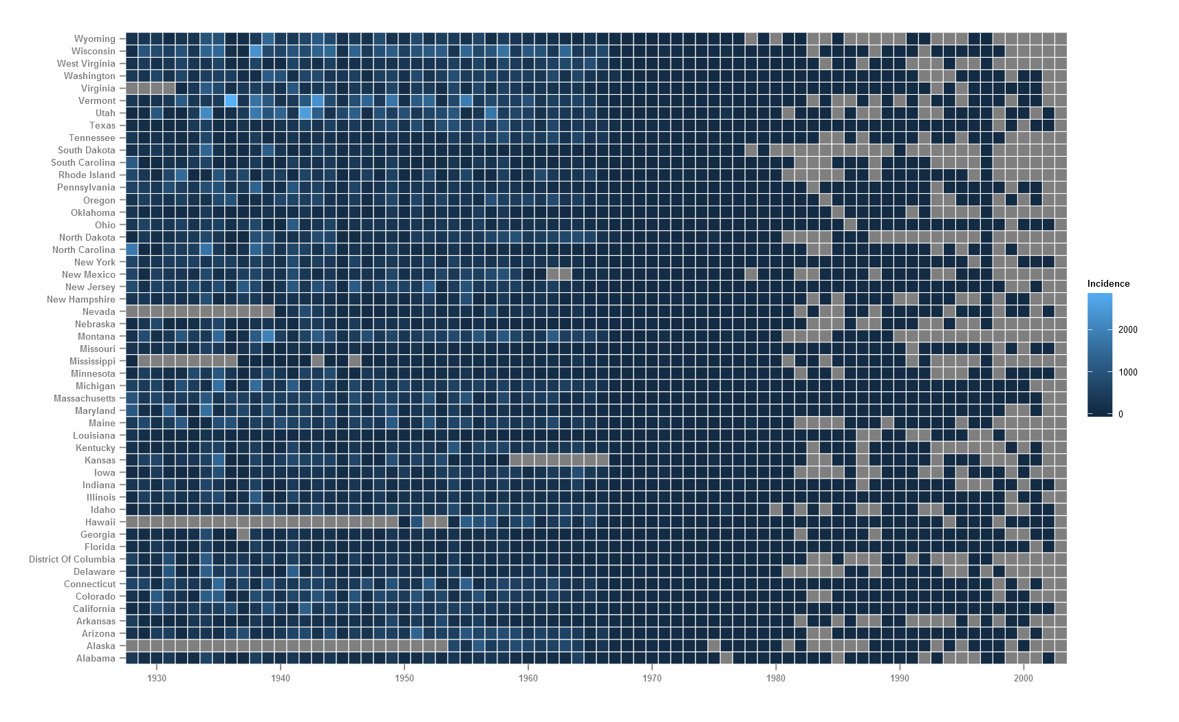
White border lines are added to each cell, x-axis and y-axis titles are removed, size of y.axis text is decreased, breaks on x-axis is changed to show every 10 years and export options use 150 dpi and type is set to cairo which produces better quality graphics.
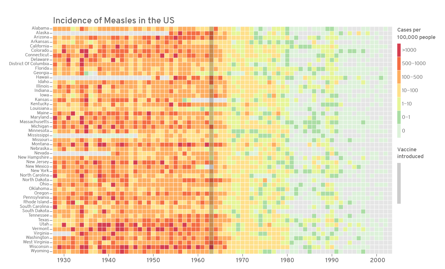
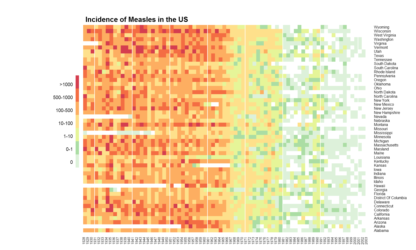
I would prefer the y-axis labels (states) to be ordered ascending top-bottom. This means going back to our ‘long’ format data and refactoring the State variable in reverse. The fill variable here (Incidence) is a continuous variable and hence, ggplot by default uses the blue colour ramp. Here and in many cases, it might make better sense to bin the continuous data into levels and represent each level as a discrete colour. The cut() function in R allows to break and label a continuous variable. Perhaps, better colours can make the figure pop.
#reverse level order of state
m3$State <- factor(as.character(m3$State),levels=rev(levels(m3$State)))

#create a new variable from incidence
m3$IncidenceFactor <- cut(m3$Incidence,
breaks = c(-1,0,1,10,100,500,1000,max(m3$Incidence,na.rm=T)),
labels=c("0","0-1","1-10","10-100","100-500","500-1000",">1000"))

#change level order
m3$IncidenceFactor <- factor(as.character(m3$IncidenceFactor),
levels=rev(levels(m3$IncidenceFactor)))
The Incidence variable is binned into 7 levels and saved as a new variable IncidenceFactor. The NAs remain as NA. Defining breaks in your variable depends on the type of data, the number of bins that make sense with the context or just trial and error. Too many bins are not good. Checking your variable using summary(x) or a boxplot(x) can reveal a lot about the data.
#define a colour for fonts
textcol <- "grey40"

#modified ggplot
p <- ggplot(m3,aes(x=Year,y=State,fill=IncidenceFactor))+
geom_tile()+
#redrawing tiles to remove cross lines from legend
geom_tile(colour="white",size=0.25, show_guide=FALSE)+
#remove axis labels, add title
labs(x="",y="",title="Incidence of Measles in the US")+
#remove extra space
scale_y_discrete(expand=c(0,0))+
#custom breaks on x-axis
scale_x_discrete(expand=c(0,0),
breaks=c("1930","1940","1950","1960","1970","1980","1990","2000"))+
#custom colours for cut levels and na values
scale_fill_manual(values=c("#d53e4f","#f46d43","#fdae61",
"#fee08b","#e6f598","#abdda4","#ddf1da"),na.value="grey90")+
#mark year of vaccination
geom_vline(aes(xintercept = 36),size=3.4,alpha=0.24)+
#equal aspect ratio x and y axis
coord_fixed()+
#set base size for all font elements
theme_grey(base_size=10)+
#theme options
theme(
#remove legend title
legend.title=element_blank(),
#remove legend margin
legend.margin = grid::unit(0,"cm"),
#change legend text properties
legend.text=element_text(colour=textcol,size=7,face="bold"),
#change legend key height
legend.key.height=grid::unit(0.8,"cm"),
#set a slim legend
legend.key.width=grid::unit(0.2,"cm"),
#set x axis text size and colour
axis.text.x=element_text(size=10,colour=textcol),
#set y axis text colour and adjust vertical justification
axis.text.y=element_text(vjust = 0.2,colour=textcol),
#change axis ticks thickness
axis.ticks=element_line(size=0.4),
#change title font, size, colour and justification
plot.title=element_text(colour=textcol,hjust=0,size=14,face="bold"),
#remove plot background
plot.background=element_blank(),
#remove plot border
panel.border=element_blank())
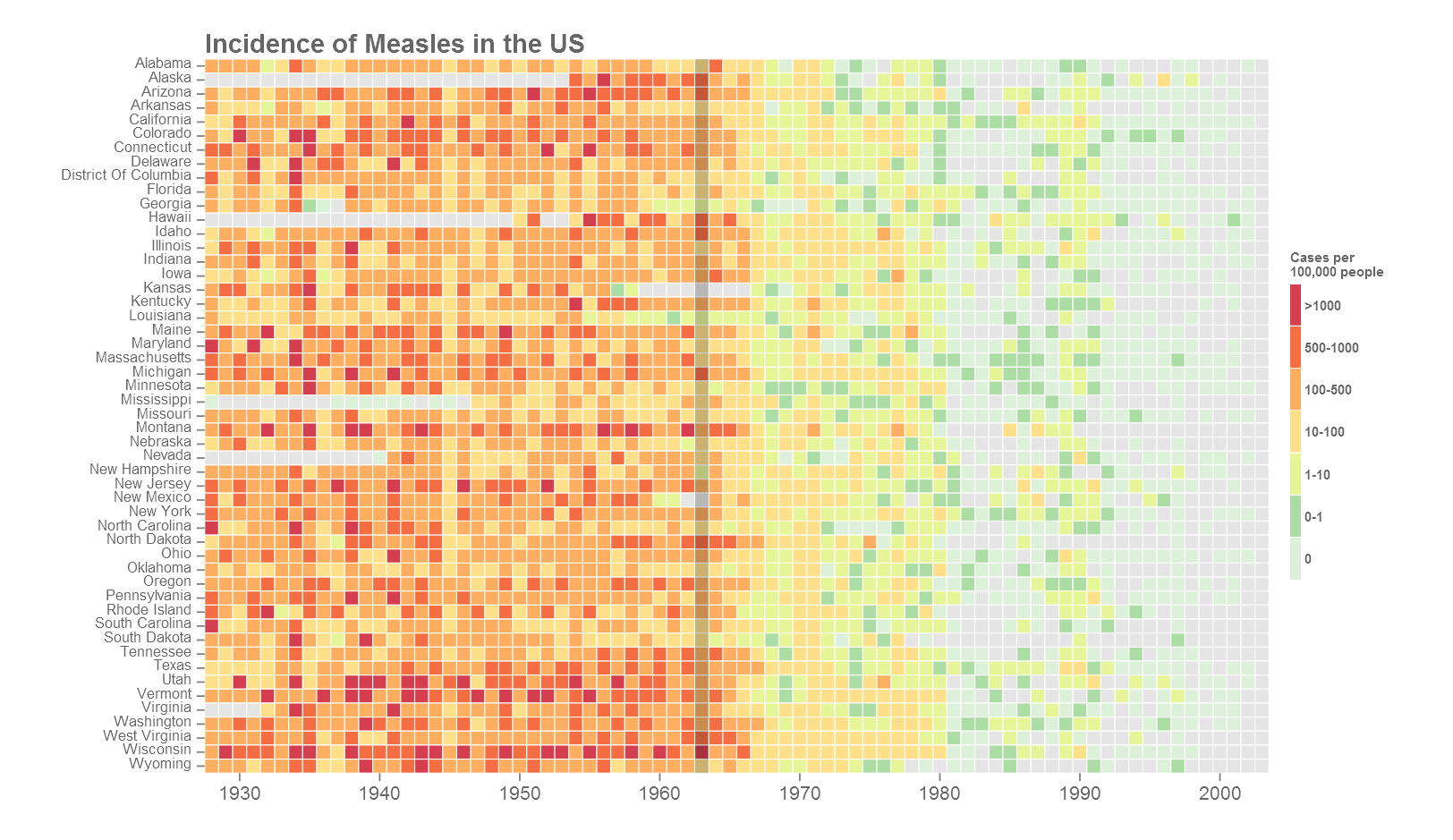
This is the final version of the figure. All font elements are coloured grey40. Missing values (NAs) are coloured grey90. The year of the introduction of vaccination is indicated as a dark vertical stripe. If the y-axis labels are too many or too small, they can be dropped the same way as the x-axis. A custom colour palette was used from ColorBrewer based on the Spectral palette. Using the R package RColorBrewer() or using ggplot2 function scale_fill_brewer() opens up all the colour palettes from the ColorBrewer website. Here is an example below:
library(RColorBrewer)

#change the scale_fill_manual from previous code to below
scale_fill_manual(values=rev(brewer.pal(7,"YlGnBu")),na.value="grey90")+
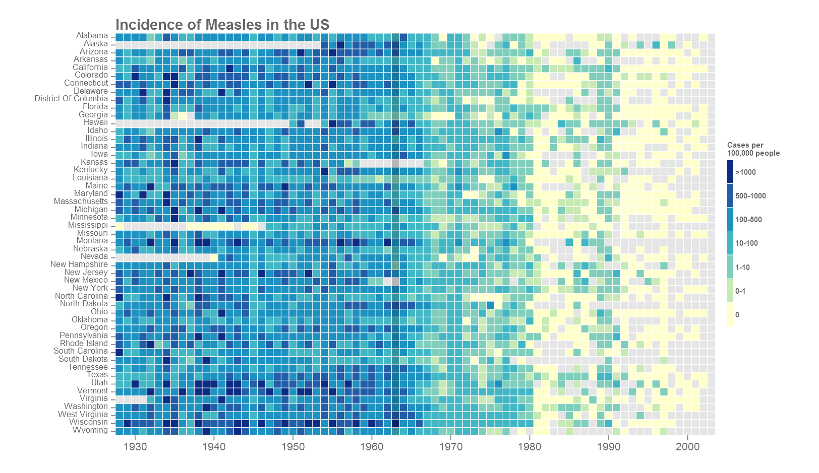
Most of the plot customisation happens in the theme() section of the code. Refer to the ggplot index for all theme arguments. Based on where the figure will go next, the fonts may need to be changed. The extrafont() package comes handy. Another option is to export in vector format such as .svg or .pdf. Import into a vector editor such as Adobe Illustrator and add your own text. This will produce nice crisp results but does take some manual work. See the cover image of this post for example.
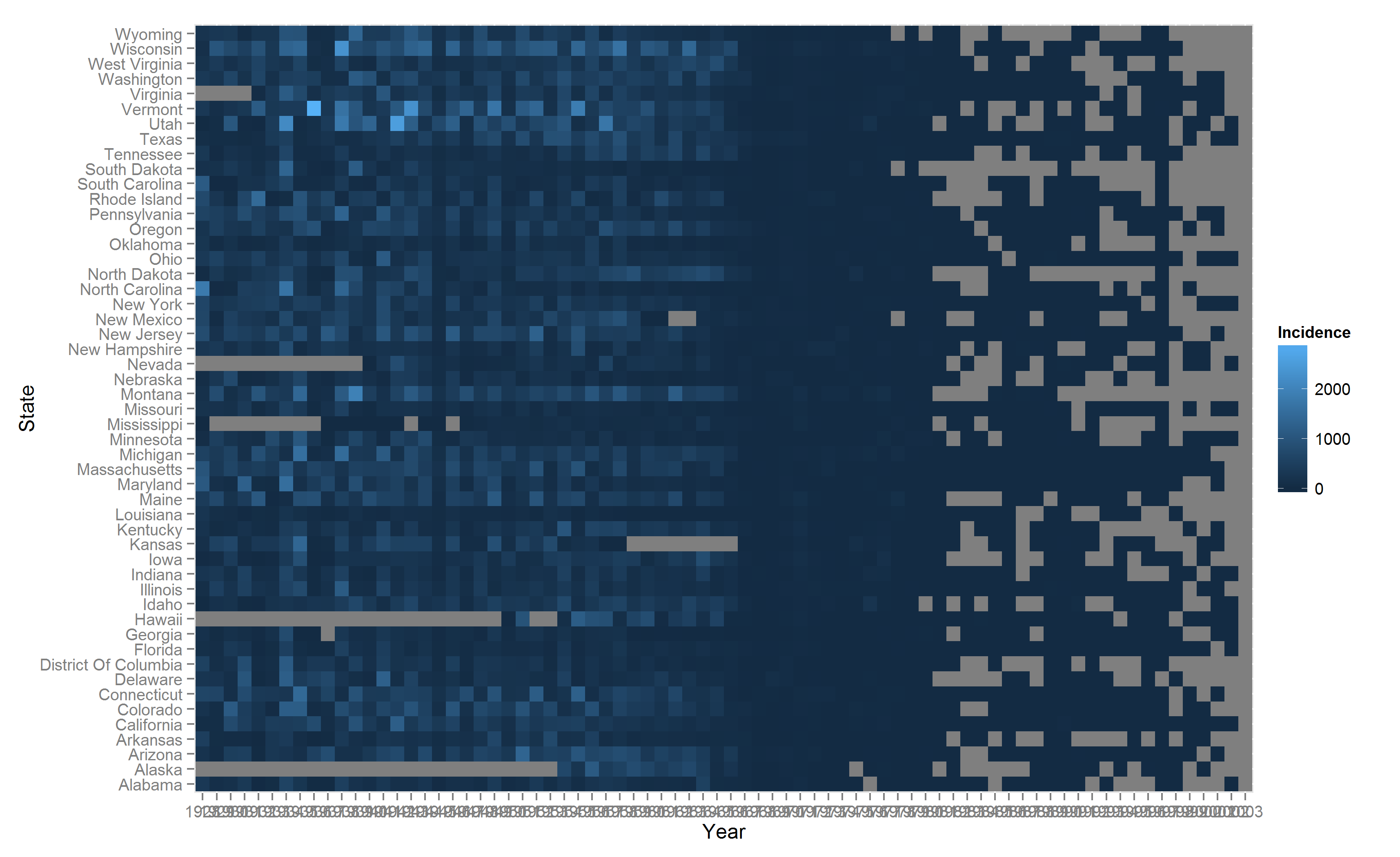
Plotting using base graphics
We will take a quick look at plotting using base graphics. The base function heatmap() and the enchanced heatmap.2() function from the gplots package uses a wide format data matrix as input. We start with the ‘long’ data that we prepared in section 1. We convert the data in ‘long’ format into ‘wide’ format using the dcast() function from package reshape2.
#convert long format to wide format
m4 <- dcast(m3,Year~State,value.var = "Incidence")
#remove state names and create a matrix
m5 <- as.matrix(m4[,-1])
#assign state names as rownames of matrix
rownames(m5) <- m4$Year
The wide data is converted to a matrix after removal of non-numeric columns. The state names are reassigned as rownames of the matrix to be used as y-axis text.
png(filename = "measles-base.png",height = 20,width = 20,res = 150,units = "cm")
heatmap(t(m5),Rowv = NA,Colv = NA,na.rm = T, scale = "none",col = terrain.colors(10),
    xlab = "", ylab = "",main = "Incidence of Measles in the US")
dev.off()
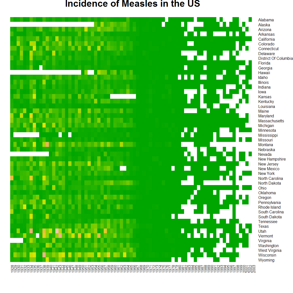
heatmap()
That’s pretty much what we can do with that. The enchanced heatmap.2() function from gplots() can do more. The legend for the colours is beyond terrible, so we will use the function gradient.rect() from plotrix package to create our own legend. And after fiddling around with numerous arguments and countless trial and errors later, we have as below.
library(gplots) #heatmap.2
library(plotrix) #gradient.rect() for legend

png(filename = "measles-gplot.png",height = 18,width = 30,res = 150,units = "cm",type="cairo")
#heatmap
heatmap.2(t(m5),na.rm = T,dendrogram = "none",Rowv = NULL,Colv = "Rowv",
trace = "none",scale = "none",offsetRow = 0.3, offsetCol = 0.3,
breaks = c(-1,0,1,10,100,500,1000,max(m3$Incidence,na.rm = T)),
#a separator line every 10 years
colsep = which(seq(1928,2003) %% 10 == 0),margin = c(3,8),
col = rev(c("#d53e4f","#f46d43","#fdae61","#fee08b","#e6f598","#abdda4","#ddf1da")),
xlab = "", ylab = "",key = F,lhei = c(0.1,0.9),lwid = c(0.2,0.8))
#legend
gradient.rect(0.125,0.25,0.135,0.75,nslices = 7,border = F,gradient = "y",
col = rev(c("#d53e4f","#f46d43","#fdae61","#fee08b","#e6f598","#abdda4","#ddf1da")))
#legend text
text(x = rep(0.118,7), y = seq(0.28,0.72,by = 0.07),adj = 1,cex = 0.8,
labels = c("0","0-1","1-10","10-100","100-500","500-1000",">1000"))
#title
title(main = "Incidence of Measles in the US",line = 1,oma=T,adj=0.21)
dev.off()
heatmap.2()
Ultimately, we get something useful. The white separator line is a neat feature. It can be used to group columns or rows as required. The while vertical lines above group decades. And below is the full undisrupted code.
# 2015 | Roy Mathew Francis
# Heatmap R code

#install packages
install.packages(pkgs = c("ggplot2","reshape2","plyr",
        "Cairo","gplots","plotrix"),dependencies = T)

#load packages
library(ggplot2) #ggplot() for plotting
library(reshape2) #melt(), dcast() for data reformatting
library(plyr) #ddply() for data reformatting
library(Cairo) #better aliasing of output images

#----------------------------------------------------------------------------

#DATA PREPARATION

#read csv file
m <- read.csv("measles_lev1.csv", header = T,stringsAsFactors = F,skip = 2)

#convert data to long format
m2 <- melt(m,id.vars = c("YEAR", "WEEK"))
#rename column names
colnames(m2) <- c("Year", "Week", "State", "Value")

#custom function to convert to camel case
camelCase <- function(string = NULL,separator = "\.") {
    if(is.null(string)) stop("No input string.n")
    s <- strsplit(string, separator)
    s <- tolower(s[[1]])
    paste(toupper(substring(s, 1, 1)), substring(s, 2),sep = "", collapse = " ")
}

#change variable to character, convert to camel case,
#remove dot and change variable back to factor
m2$State <- factor(as.character(sapply(as.character(m2$State),camelCase)))

#change variable types
m2$Year <- factor(m2$Year)
m2$Week <- factor(m2$Week)
#also converts '-' to NA
m2$Value <- as.numeric(m2$Value)

#custom sum function returns NA when all values in set are NA,
#in a set mixed with NAs, NAs are removed and remaining summed.
naSum <- function(x)
{
    if(all(is.na(x))) val <- sum(x,na.rm = F)
    if(!all(is.na(x))) val <- sum(x,na.rm = T)
    return(val)
}

#sums incidences for all weeks into one year
m3 <- ddply(m2,c("Year","State"),Incidence = round(naSum(Value),0),summarise)

#----------------------------------------------------------------------------

#GGPLOT2

#basic ggplot
p <- ggplot(m3,aes(x = Year,y = State,fill = Incidence))+
        geom_tile()

#save plot to working directory
ggsave(filename = "measles-basic.png",plot = p)

#modified ggplot
p <- ggplot(m3,aes(x = Year,y = State,fill = Incidence))+
    geom_tile(colour = "white",size = 0.25)+
    xlab("")+
    ylab("")+
    scale_y_discrete(expand = c(0,0))+
    scale_x_discrete(expand = c(0,0),breaks = c("1930","1940","1950","1960","1970","1980","1990","2000"))+
    coord_fixed()+
    theme_grey(base_size = 8)+
    theme(legend.position = "right",
        axis.text = element_text(face = "bold"),
        axis.ticks = element_line(size = 0.4),
        plot.background = element_blank(),
        panel.border = element_blank())

ggsave(filename = "measles-mod1.png",plot = p,dpi = 150,type = "cairo")

#reverse level order of state
m3$State <- factor(as.character(m3$State),levels = rev(levels(m3$State)))
#create a new variable from incidence
m3$IncidenceFactor <- cut(m3$Incidence,
                breaks = c(-1,0,1,10,100,500,1000,max(m3$Incidence,na.rm = T)),
                labels = c("0","0-1","1-10","10-100","100-500","500-1000",">1000"))
#change level order
m3$IncidenceFactor <- factor(as.character(m3$IncidenceFactor),
levels = rev(levels(m3$IncidenceFactor)))

#assign text colour
textcol <- "grey40"

#further modified ggplot
p <- ggplot(m3,aes(x = Year,y = State,fill = IncidenceFactor))+
    geom_tile()+
    geom_tile(colour = "white",size = 0.25, show_guide = FALSE)+
    labs(x = "",y = "",title = "Incidence of Measles in the US")+
    scale_y_discrete(expand = c(0,0))+
    scale_x_discrete(expand = c(0,0),breaks = c("1930","1940","1950","1960","1970","1980","1990","2000"))+
    #library(RColorBrewer)
    #scale_fill_manual(values = rev(brewer.pal(7,"YlGnBu")),na.value = "grey90")+
    scale_fill_manual(values = c("#d53e4f","#f46d43","#fdae61","#fee08b","#e6f598","#abdda4","#ddf1da"),na.value = "grey90")+
    coord_fixed()+
    theme_grey(base_size = 10)+
    theme(legend.position = "right",legend.direction = "vertical",
        legend.title = element_blank(),
        legend.margin = grid::unit(0,"cm"),
        legend.text = element_text(colour = textcol,size = 7,face = "bold"),
        legend.key.height = grid::unit(0.8,"cm"),
        legend.key.width = grid::unit(0.2,"cm"),
        axis.text.x = element_text(size = 10,colour = textcol),
        axis.text.y = element_text(vjust  =  0.2,colour = textcol),
        axis.ticks = element_line(size = 0.4),
        plot.background = element_blank(),
        panel.border = element_blank(),
        plot.title = element_text(colour = textcol,hjust = 0,size = 14,face = "bold"))

#export figure
ggsave(filename = "measles-mod3.png",plot = p,dpi = 150,type = "cairo")

#----------------------------------------------------------------------------

#BASE GRAPHICS

#load package
library(gplots)
library(plotrix)

#convert from long format to wide format
m4 <- dcast(m3,Year~State,value.var = "Incidence")
m5 <- as.matrix(m4[,-1])
rownames(m5) <- m4$Year

#base heatmap
png(filename = "measles-base.png",height = 20,width = 20,res = 150,units = "cm")
heatmap(t(m5),Rowv = NA,Colv = NA,na.rm = T, scale = "none",col = terrain.colors(100),
        xlab = "", ylab =  "",main = "Incidence of Measles in the US")
dev.off()

#gplots heatmap.2
png(filename = "measles-gplot.png",height = 18,width = 30,res = 150,units = "cm",type="cairo")
gplots::heatmap.2(t(m5),na.rm = T,dendrogram = "none",Rowv = NULL,Colv = "Rowv",trace = "none",scale = "none",offsetRow = 0.3, offsetCol = 0.3,
                    breaks = c(-1,0,1,10,100,500,1000,max(m3$Incidence,na.rm = T)),colsep = which(seq(1928,2003) %% 10 == 0),
                    margin = c(3,8),col = rev(c("#d53e4f","#f46d43","#fdae61","#fee08b","#e6f598","#abdda4","#ddf1da")),
                    xlab = "", ylab =  "",key = F,lhei = c(0.1,0.9),lwid = c(0.2,0.8))
gradient.rect(0.125,0.25,0.135,0.75,nslices = 7,border = F,gradient = "y",col = rev(c("#d53e4f","#f46d43","#fdae61","#fee08b","#e6f598","#abdda4","#ddf1da")))
text(x = rep(0.118,7), y = seq(0.28,0.72,by = 0.07),adj = 1,cex = 0.8,labels = c("0","0-1","1-10","10-100","100-500","500-1000",">1000"))
title(main = "Incidence of Measles in the US",line = 1,oma=T,adj=0.21)
dev.off()

#-------------------------------------------------------------------------------
#End of script
Conclusion
We have covered data prep and plotting heatmaps in R using base graphics and ggplot2. ggplot2 seems more consistent with code structure but the base graphics may be useful when combing multiple graphics in complicated ways. Hacking ggplot2 can be harder than fiddling with base graphics. I have not covered heatmaps with dendrograms because they are only useful in specific situations. I refer you to other articles such as this, this and this for more information.


Comments