Scientific graphics are key to understanding complex data. In addition to graphing data, it is important that the graphics are clean, elegant and visually stunning. This post explores examples of attractive graphs from popular magazines and news websites.
This is the flow of understanding data.
Data collection > Data analysis > Data visualisation
The most important part of a plot is of course its content. Once you have good content/data, you need to think about how to represent this data. Which sort of plot to use. How to best convey this information. See this article for most common types of data visualisation. Some of the popular programming environments for plotting include R and Python with Julia being the latest addition. Other options include Excel, Tableau, Plotly and more. R is a great tool for graphics as evident from the numerous images, blogs and publications over the past years. There are several resources that can help you find code to create all sorts of graphs in R.
But, just managing to create a graph is not sufficient in my opinion. The graphic has to be beautiful, elegant, user-friendly and attractive. Getting from data to a plot is one thing, but creating a high-quality, publishable and professional looking figure is a different story. A Basic plot is the initial basic output figure from any plotting software. This uses the default setting and default looks. Most people stop at this point because they have gone through considerable effort to get the data, analyse it and finally figure out the code to plot it. But a basic plot is usually not going to look professional or elegant. It will need some level of customisation to make it attractive. The ggplot2 plotting package in R, for example, produces a pretty decent default output, but they are overused and the graphics are not unique or catchy. I haven’t come across many sources that go into the fine details of the making a professional looking graph. We will go into plot customisation in R in a future post, but, in this post, we explore some examples of customised plots.
Professional graphs
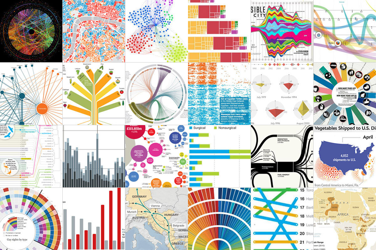
The first step to creating elegant plots is to understand what makes a good plot. Since its hard to say exactly what is a good-looking graph and a bad-looking one, I will use examples. I usually take figures, plots or graphics in popular magazines as a quality benchmark. My favourite choices are scientific journals like Nature and Science that produce customised graphics, scientific magazines such as National Geographic, Scientific American, New Scientist, American Scientist etc. and popular news websites such as BBC, The Guardian, The Huffington Post, The Telegraph, The New York Times etc. They usually have high quality data visualisation, illustrations, figures and graphics. This post will focus more on graphs and plots. We will avoid highly customised complex illustrations, infographics and interactive graphics for now. Those will be perhaps dealt with in a future post. The examples are roughly organised from simple to complex graphics.
BBC
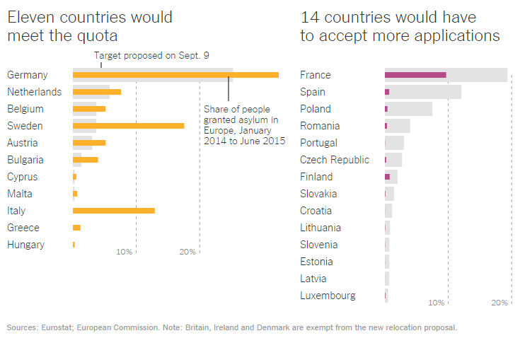
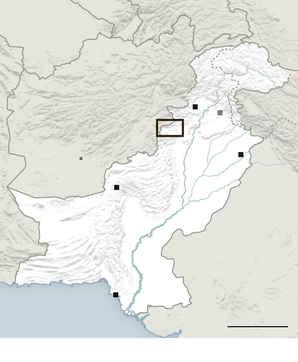
The BBC example used is from a recent article on the European migrant crisis.
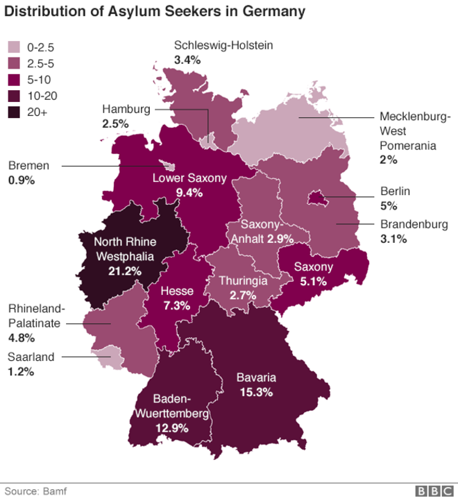
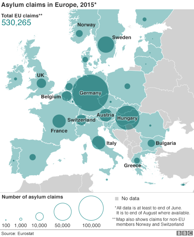
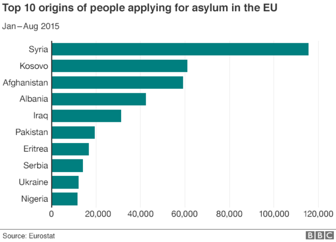
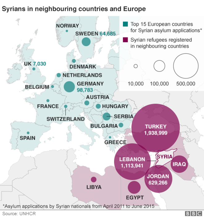
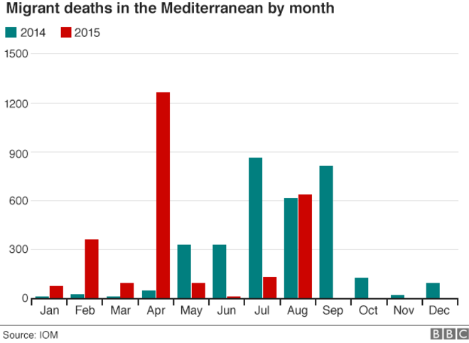
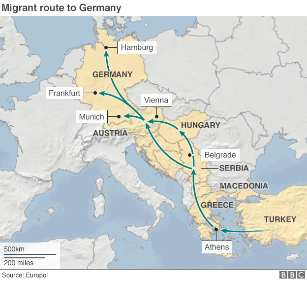
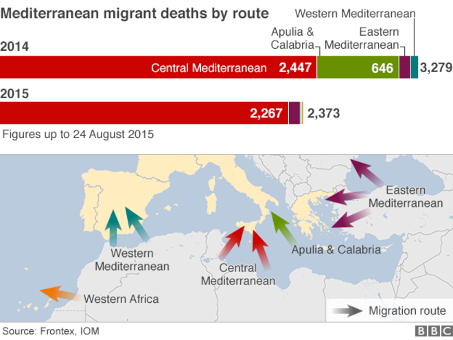
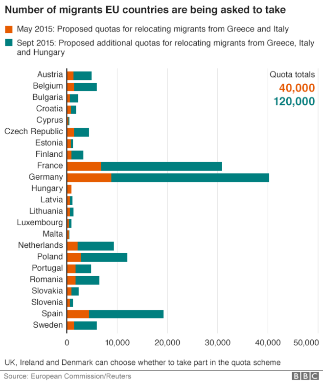
These are typical BBC graphics: clean and minimal. Text is clear and legible. Colours are few, distinct and catchy. Text colour is around 80% grey. The first figure combines a stacked horizontal barplot with an annotated map. Colours in the barplot match the arrows on the map. Second and third figures show standard barplots. Notice the use of simple gridlines to enable easier comparison of values. Axes lines are removed where not necessary. Second and third figures show standard barplots. In the fourth figure, notice the use of white background fill colour for city names to increase legibility. The fifth figure uses circles on maps to denote number of claims per country. Notice the use of white border for text on dark background. In the last figure, notice the use of sequential colour palette to represent binned data. And neighbouring countries and lines have been removed to reduce clutter.
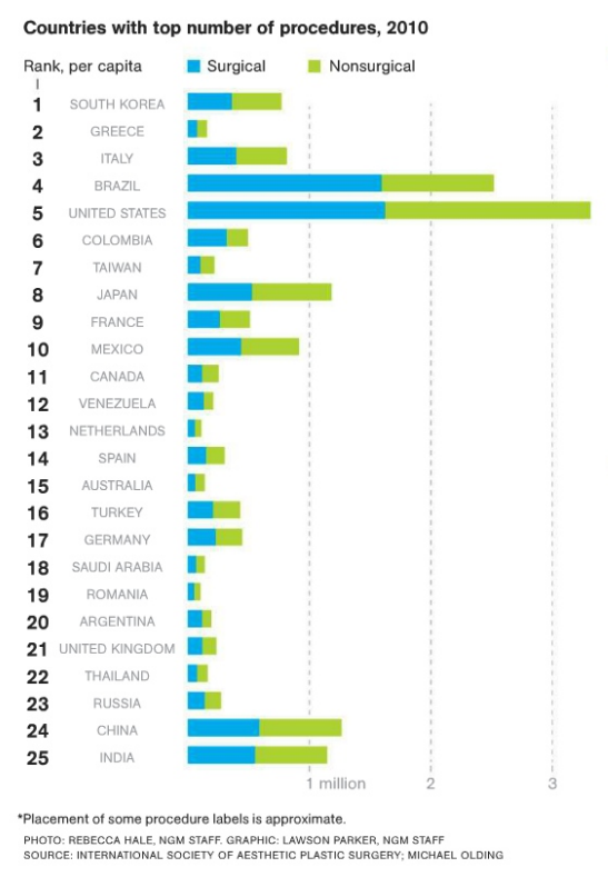
National Geographic
We will focus on two graphs from an article on Dolphin intelligence.
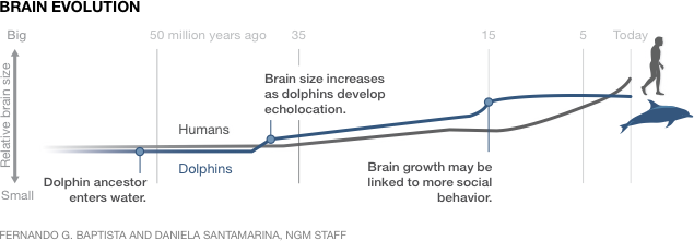
Here we have a timeline plot. Small pictograms (to scale) allow the viewer to quickly understand the animals in comparison and get a sense of their sizes. Subtle colours (dark teal blue & grey) are used but they are easy to differentiate. Timeline annotation and gridlines are about 20% grey and muted such that they can be used as guide but not strong enough to overpower the subject. Notice the font size and the font weight. The three important events on the timeline are emphasized with bold font.
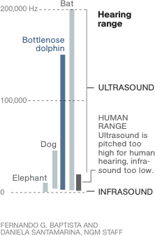
Even without a caption, the boldest font ‘Hearing range’ captures your attention. The figure compares the hearing frequency range of five animals. This is a slight variation of a regular barplot. The bars don’t always go to zero. The dog for example can only hear down to about 44 hertz. Note the number of colours used and their hues. Note the font sizes and the use of full caps. Also, note that all figures in the article use a similar colour scheme and consistent look.
Here are a few more examples below showcasing customised lineplots, barplots, maps and slopecharts.
Have a look at the two plots below. They both show the same information. On left is what they call a slopechart and right is a scatterplot. I think they are both good and it’s a matter of personal taste as to which is better. Here is a discussion about the use of these chart types.
The Huffington Post
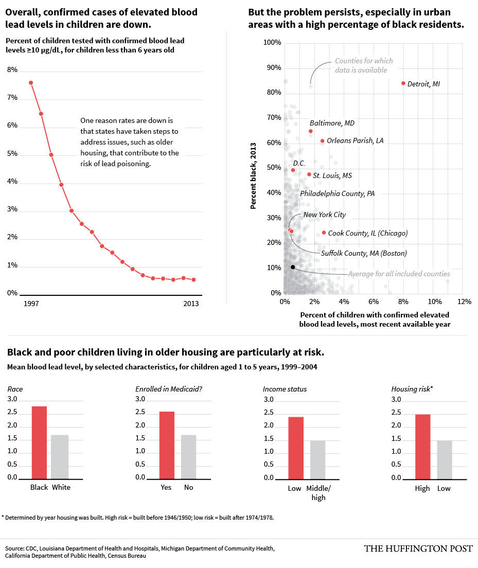
Here is an example from The Huffington Post on the risk of lead poisoning. The figure shows lineplots, scatterplots and barplots. Most of the text is in black although guide text is light grey. The colour scheme is shared between the three plots as they belong as a group. Selected data points are highlighted on the scatterplot. Notice level 1, level 2 and level 3 title fonts.
Thomson Reuters
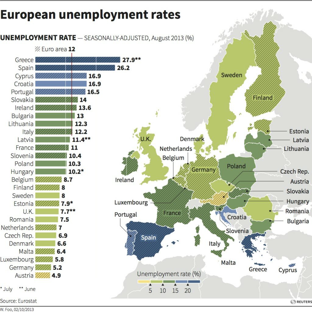
Here is a Reuters graphic showing unemployment rates in Europe using a barplot combined with map. The colour scheme is a bit strange in using different colours for sequential continuous data. The title and number font may seem a bit too bold and black (85% gray). But, the graphic is still quite appealing in general. The eurozone countries are marked by crossline shading. Neighbouring countries are grayed out to be less prominent but still puts the subject in context.
The New York Times
The examples from The New York Times include the value of honey bees in pollination (barplot), chemical weapons found in Iraq, deaths in Afghanistan (barplots and maps) and the ebola outbreak.
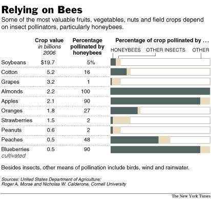
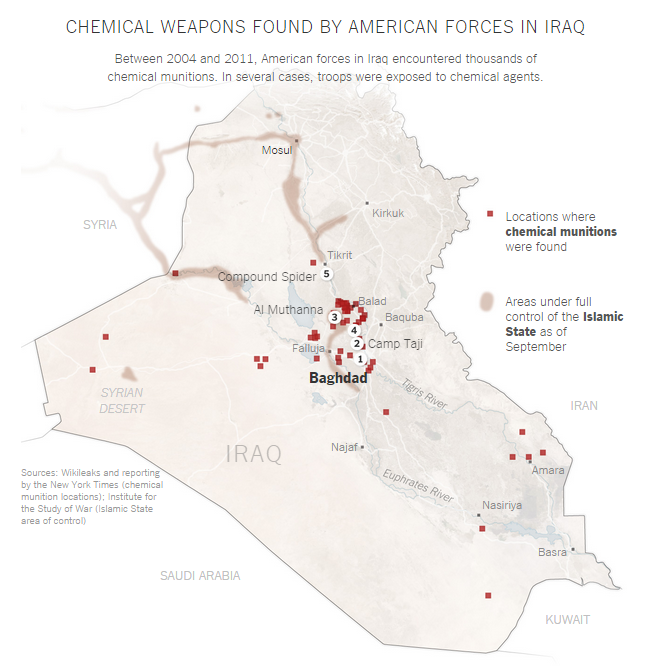
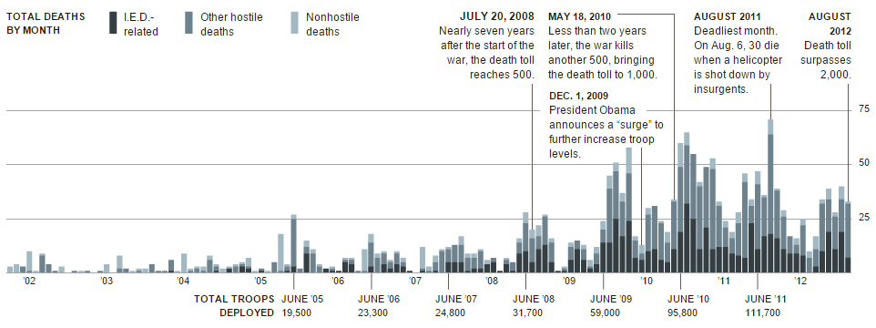
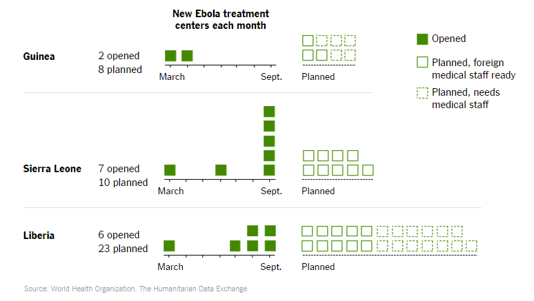
Relying on bees is an interesting use of a stacked barplot along with a table. The chemical weapons graphic is a standard map with subtle colours and location names. The deaths in Afghanistan page has a collection of barplots and scatterplots on maps. The greyish colour scheme is clear and simple and frequently used in The New York Times graphics. Events of interest are marked on the timeline. The ebola outbreak page has a few examples of simple barplots, lineplots and maps. The last figure is a customised dotplot showing new ebola treatment centers. Another great example is below.
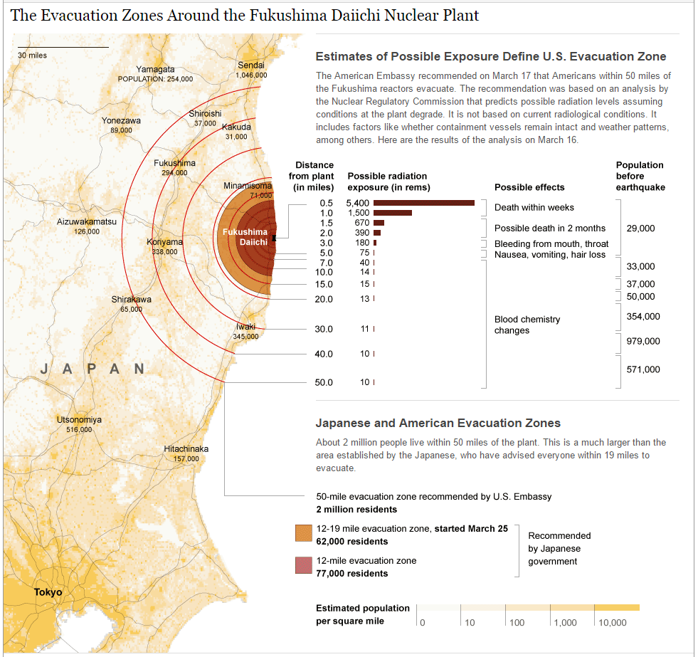
This example combines a map plot with table and text. The map shows the region around the nuclear plant, estimated population in the surrounding areas (shown in a subtle yellow colour) and the distance from the plant as concentric circles. The distance markers are combine with an inline barplot and table to reveal more data. This is more in the realm of infographics.
In R, barplots can be plotted using the base function barplot as well as using lattice and ggplot2 packages. Creating maps in R can be achieved using a variety of functions from the base function maps to packages ggplot2, ggmap and RGoogleMaps. Creating maps in base R is like a jungle as one needs several functions spread across numerous packages such as maptools, mapproj, raster, rgeos, rgdal, sp, spatstat etc. depending on the task at hand. Interactive mapping options are available from the rCharts and ggvis package. Choropleth maps are very popular to visualise all sorts of variables over spatial data.
The Wall Street Journal
The Wall Street Journal is quite well known for their stellar graphics. They even have a guide to information graphics.
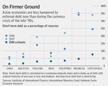
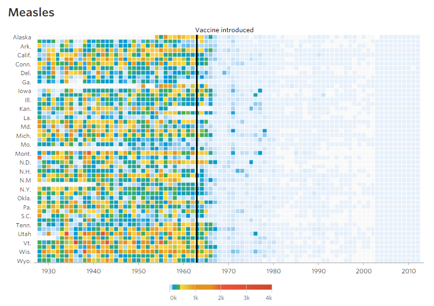
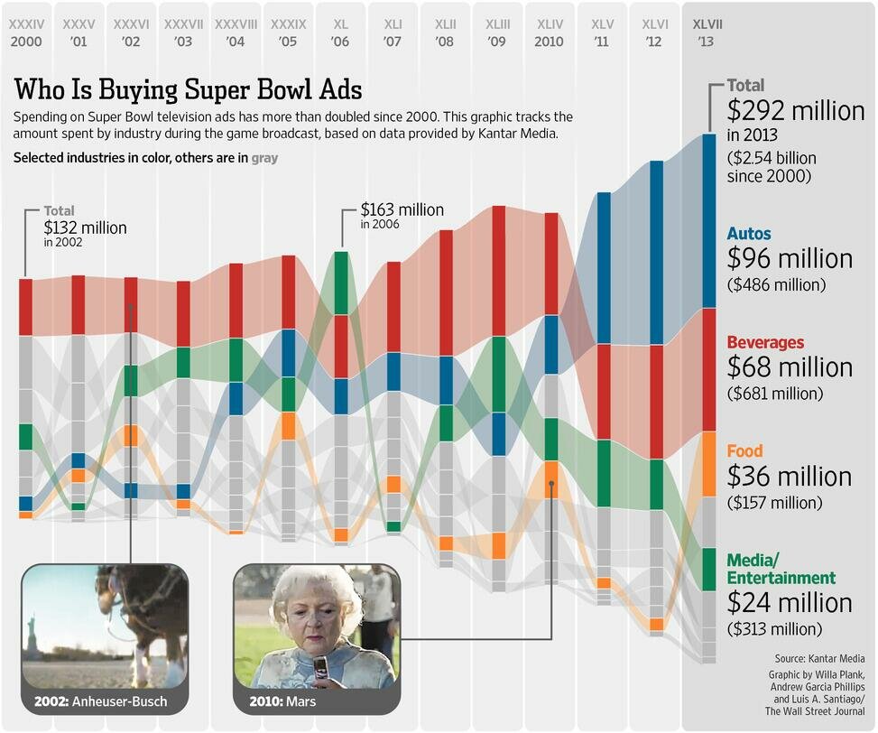
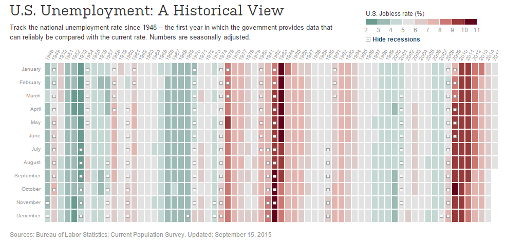
The first figure shows the external debt of some Asian countries. These graphs are referred to as dotplots or stripcharts. And this is an excellent example of how and when to use it. When there are few data points as such, it better to show the actual points rather than a mean or boxplot. Dotplots are not ideal when dealing with too many points. The second figure shows the value of advertising during the superbowl from this article. The figure shows the proportion of advertising categories and the absolute value over time. It’s similar to a stacked barplot except that heights are not fixed. Each bar is 100% of the expenses but adds up to a different amount each year. Each bar is also sorted top to bottom by highest to lowest spending category. It’s easy to visualise the rise in automobile advertising over the years. The third figure is a good example of heatmap from this article on diseases and vaccination. The last figure shows a heatmap of unemployment rate in the US over time. Heatmaps are great for easily visualising trend in tabular data. Notice the complex colour palette for the disease heatmap and a simple diverging red-green heatmap for the unemployment graph. In fact, the palette is not just a simple red-green, it is also colour-blind compatible. Test this figure at Coblis.
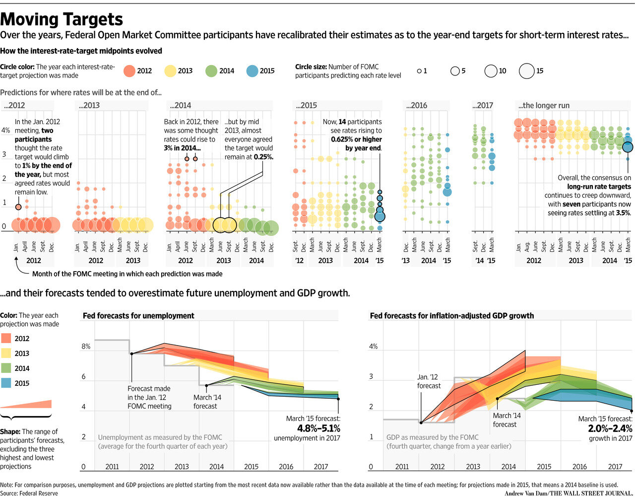
Here is a complex example from The Wall Street Journal combining dotplots, scatterplots and what-not. The figure is quite pretty although I am not sure exactly what it is about.
In R, dotplots can be created using the base functions dotchart or stripchart, or dotplot from lattice package or using the ggplot2 package. Heatmap options in R include the base function heatmap, heatmap.2 from gplots package and using the ggplot2 package.
The Guardian
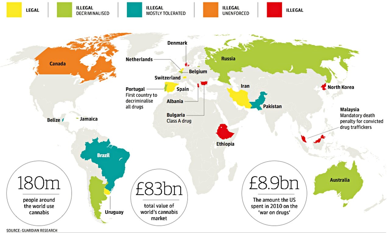
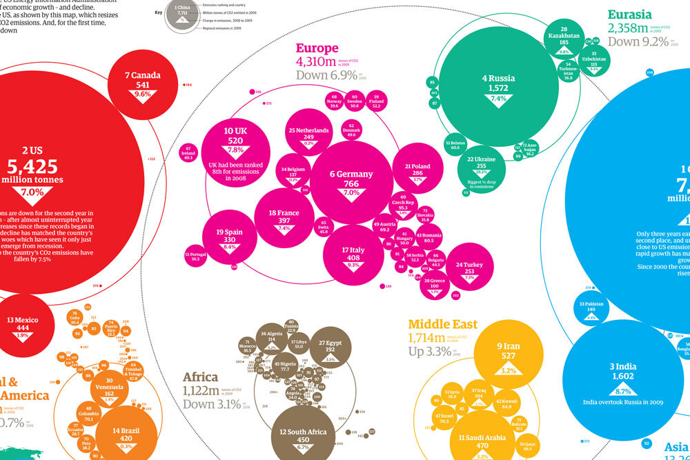
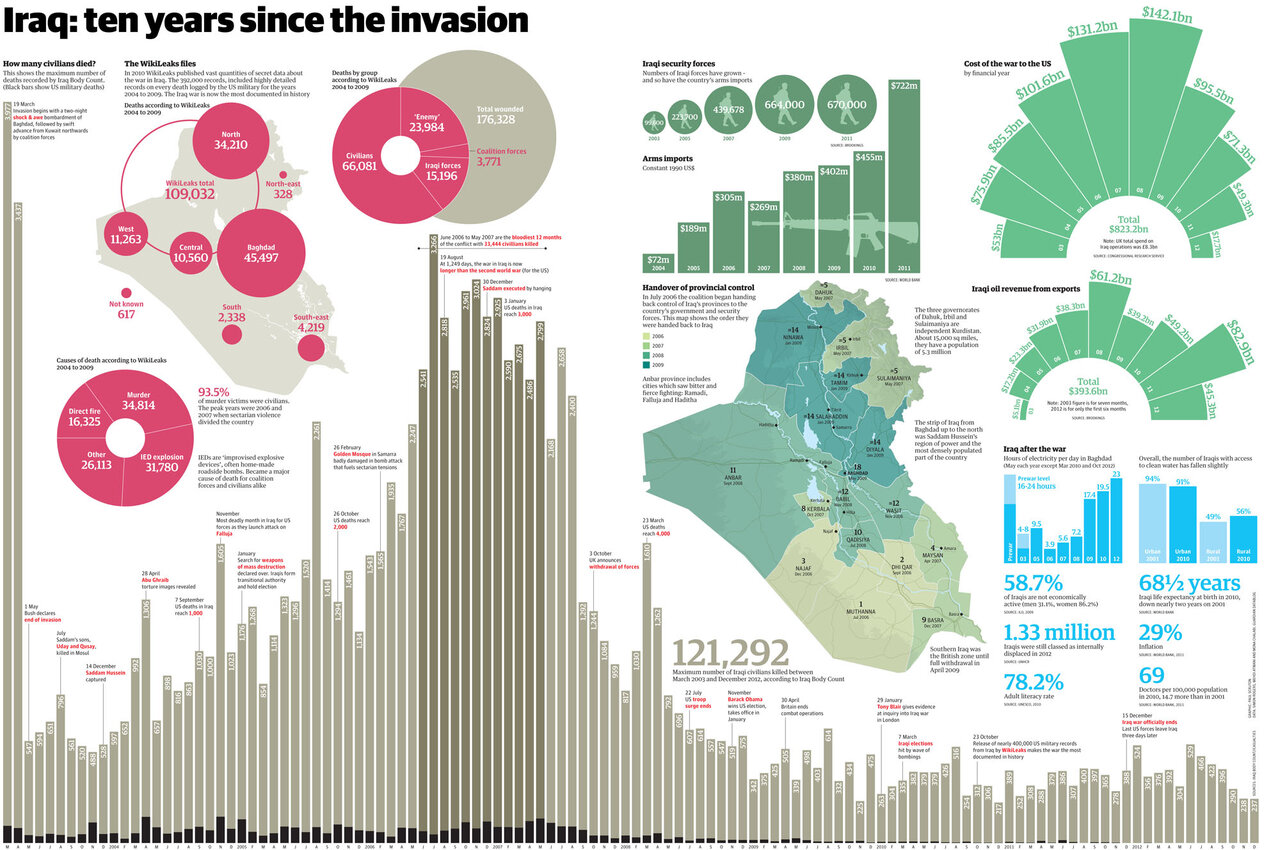
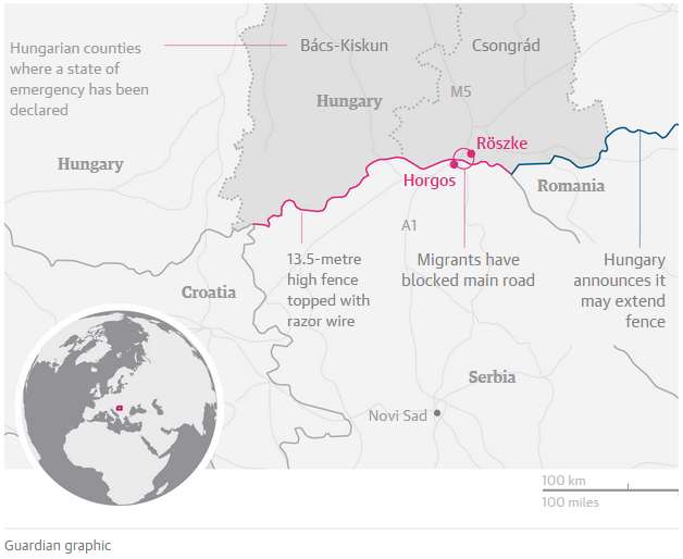

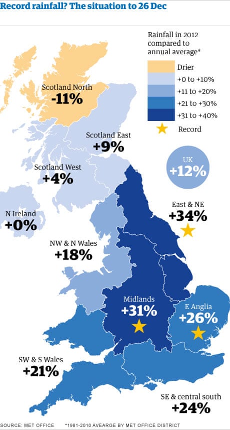
The Guardian has some beautifully customised graphics. Some of them use colours that are bold and attention seeking. The Guardian uses their own font Guardian Egyptian. A few examples are shown here are mapping rainfall in the UK, world CO2 emissions in 2008-2009, a decade of Iraq war visualised and the 2015 refugee crisis around the Hungary-Serbia border. Differentially sized circles has been used in several infographics from The Guardian. Sometimes, there are better ways to represent the data than circles. Here is a discussion on it. The last two examples have muted colours. Note the use of an inset world map to direct the viewer to the region on the main map.
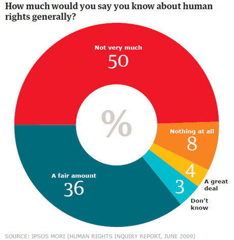
The Guardian is a good source of pie charts and donut charts.
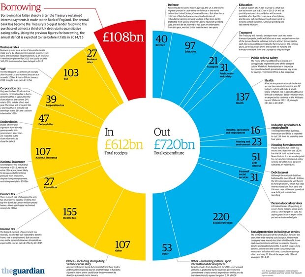
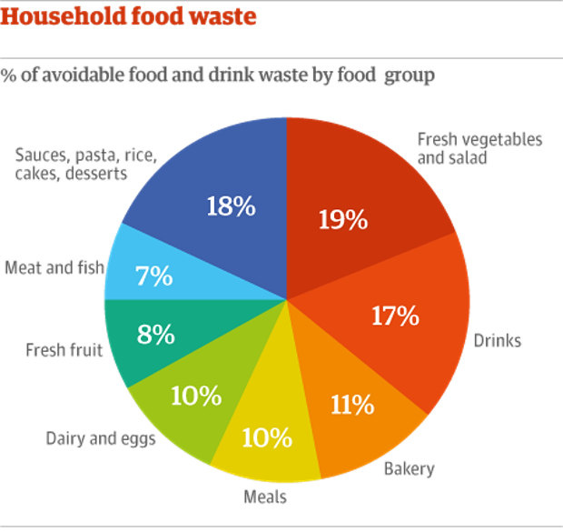
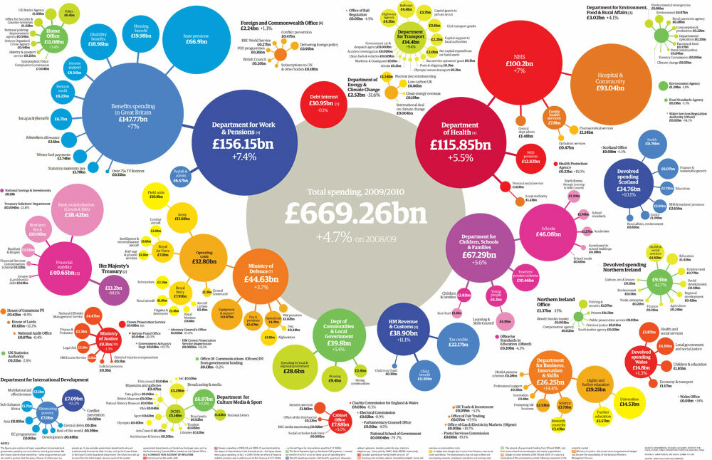
They are usually bright and colourful. They come in various levels of complexity. These examples are from the following articles on human rights, household food waste and UK government spending. No talk about pie charts is complete without a visit here.
In R, pie charts can be created using the base function pie as well as using ggplot2 package. There is also the option of function gvisPieChart from the googleVis package for interactive pie and donut plots.
Scientific American
Scientific American usually has heavily customised graphics with illustrations which is more in the realm of infographics. This is not possible without major investment in time as well as some serious digital arts skills. Nevertheless, it can still be used as inspirational material to get creative about how to best represent your data. The colours and fonts should also be noted. Check out Jens Christiansen’s work for SA.
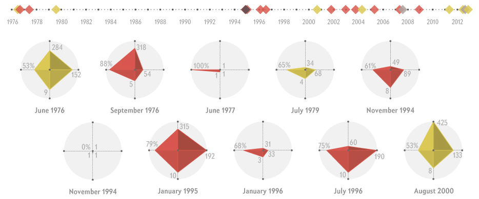
Here is an article on Ebola outbreaks which shows an interesting way to represent multivariate data, something called radarplots. There is a lot of debate on the use of radarplots with regard to their readability and comparison on independent axes. In this example, I think this is a good choice of data visualisation. The four variables denote mortality rate, infected individuals, transmission clusters and number of days of outbreak. Essentially, smaller values are bad, but larger values are worse. Therefore, just looking at the area of the polygon gives you a sense of how bad the outbreak was and makes it easy to compare to other outbreaks. Radarplots are not advisable for all types of data and fewer the variables, the better. Radarplots can be created in R using the base function stars, radial.plot from plotrix package or package ggplot2.
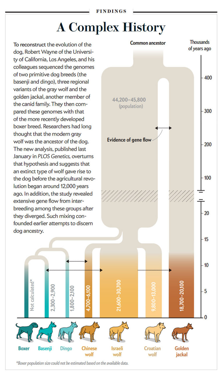
This is a phylogenetic tree commonly used to represent the divergence of species over time from the article: How Wolves became Dogs. Notice the vertical timeline with length of lines representing time, width of lines representing population sizes, variations of similar colours to denote clades and pictograms to identify species. The tight narrow region with few individuals at 15,000 years is a bottleneck event which then led to a radiation of lineages.
Phylogenetic trees in R needs the use of several packages such as ape, ade4, adegenet, adephylo, pegas, phangorn etc. This book has pretty much everything you need to know about working with phylogenetics in R.
New Scientist
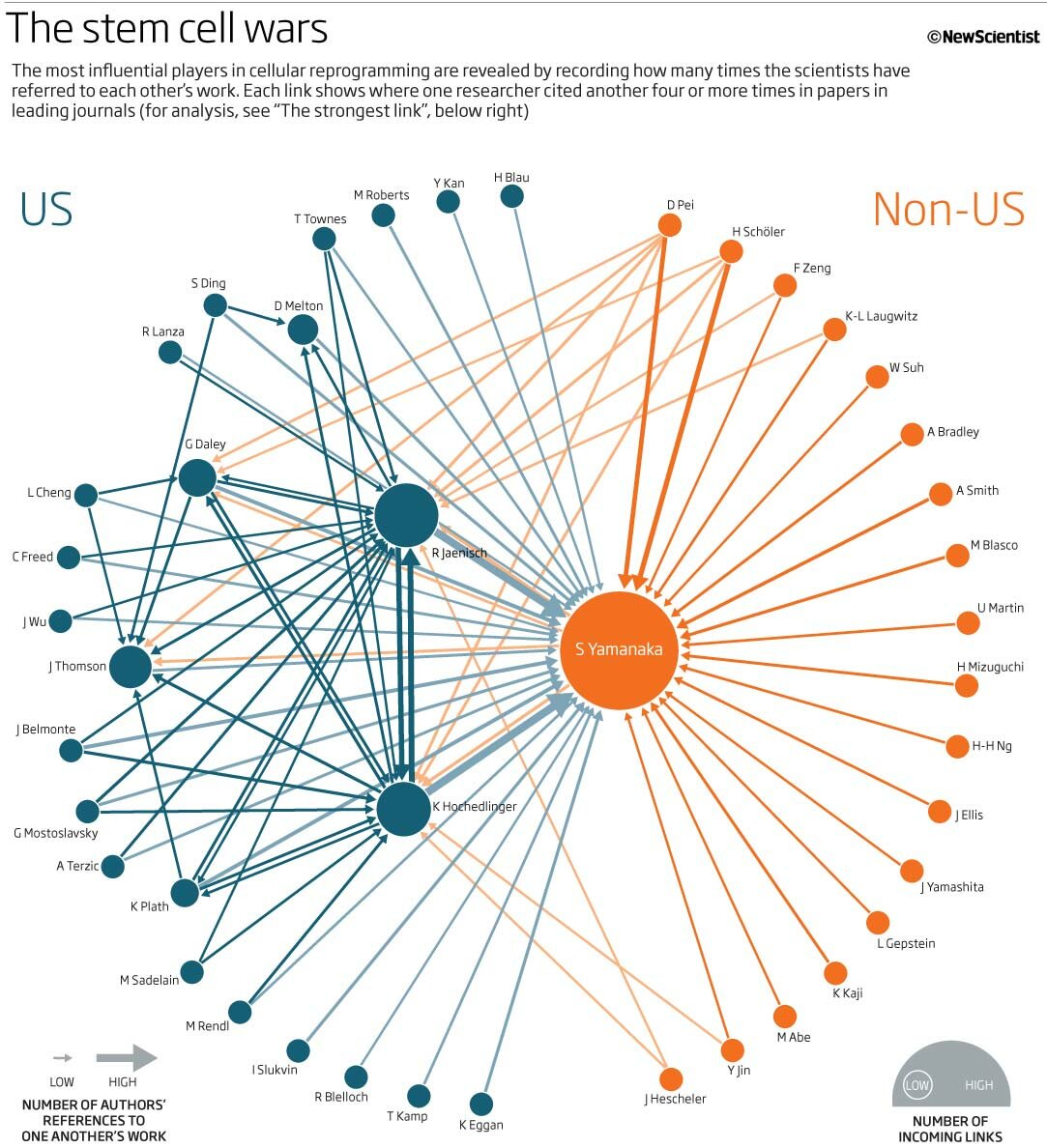
This article called Paper Trail: Inside Stem Cell Wars from June, 2010 uses a network graph to representation article citations between authors working in the field of stem cell research. Here is a discussion on this figure. Network graphs are useful to represent relationships between objects. Network graphs are widely used to present social media connections. Network graphs can be created in R using packages igraphs or ggplot2 and network.
Another approach to presenting relationships is called Sankey plots. This has become more popular lately.
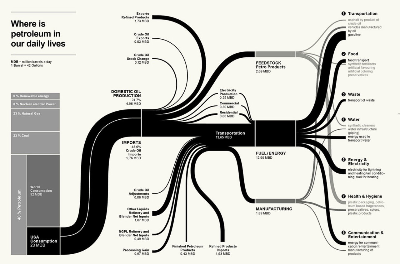
Here is a Sankey plot showing US petroleum consumption from this webpage. Static Sankey plots can be created in R using the riverplot package and interactive versions can be created using the rCharts or googleVis packages.

Here is an example of a treemap. They were invented for visualising distribution and usage of storage space on hard drives which is still their best application. TreeMaps can be created in R using packages portfolio or treemap.
Conclusion
In summary, we have explored examples of elegant graphics from some of the leading magazines and newspapers, looked at various types of plots, discussed properties of some of the plots and noted the functions used to create these plots in R. There are of course lot more functions and packages in R to do the same task. It is beyond the scope of this post to go into the details of every function. The purpose of this post to take a good look at high quality graphs, so that we are aware of what to aim for, while creating our own figures. In future posts, I will go into creating customised plots in R.
Further reading
Interested in more scientific figures and data visualisation? Here are some links. Some of them fall into the category of infographics.
- http://weather-radials.com/
- http://flowingdata.com/
- http://www.informationisbeautiful.net/
- http://betterfigures.org/
- http://chartsnthings.tumblr.com/
- http://coffeespoons.me/
- http://spatial.ly/
- http://www.r-bloggers.com/
- http://www.dailyinfographic.com/
- http://www.coolinfographics.com/
- http://visual.ly/get-inspired

Comments